Color blindness or color vision deficiency (CVD) is a condition where people cannot easily distinguish colors. Color blindness affects 1 in 12 men (8%) and 1 in 200 women worldwide. There are many types of color blindness to include the following:
- Protanopia (Red-Green Color Blindness)
- Deuteranopia (Green Color Blindness)
- Tritanopia (Blue-Green Color Blindness)
One of the primary ways content developers can produce accessible experiences is by selecting colors that have sufficient contrast. While having colors that are too close in contrast can make them indistinguishable, we must consider how fatiguing it can be to have poor contrast. Good color contrast is essential for a good experience for all sighted users!
Exercise: Low Vision / Color Blind Simulation
In this exercise we will use a simulation tool to see how someone with vision impairments might perceive a web page.
- In Chrome, start the A11Y - Color Blindness empathy test

- To get a better understanding of how someone with a vision challenge may perceive your content, try each of the pervasive issues and blocked visual field simulations.
Different types of color deficiency will create different experiences based on ability. The lines below would be very difficult for a person with color deficiency to distinguish!
The W3C is is the main international standards organization for the World Wide Web.
The W3C is is the main international standards organization for the World Wide Web.
The W3C is is the main international standards organization for the World Wide Web. The W3C is is the main international standards organization for the World Wide Web.
The W3C is is the main international standards organization for the World Wide Web.
How do the lines below change when setting the color deficiency setting?
What accessibility challenges would the following form elements present?
Instructions: All fields in red are required
Color Testing
In upcoming sections, we will review the rules related to color. For now, we will review a basic WCAG Success Criteria, 1.4.3 Contrast (Minimum), and testing strategy. The goal of this exercise is to gain an understanding of how color is evaluated.
For this exercise, you will need to download and install the Color Contrast Analyzer. It is free and available for Windows and Mac. If your organization supports another tool, please feel free to use.
- The visual presentation of text and images of text has a contrast ratio of at least 4.5:1, except for the following: (Level AA)
- Large Text: Large-scale text and images of large-scale text have a contrast ratio of at least 3:1;
Exercise:
- Download and install the Colour Contrast Analyser if you have not been provided one.
- Start the Colour Contrast Analyzer
 .
. 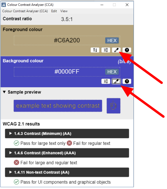 On the words below, use the Foreground colour ink dropper to select a foreground color.
- Now use the background colour ink dropper to select the background color.
NOTE: For best results, inspect elements to get the actual color codes from the page CSS! - The 1.4.3 Contrast (Minimum) (AA) will run a caluclation to determine if the forground color and background color pass.
As you will note, there is a different standard for regular text and large text. For now, think of regular text as the text in a paragraph and any text other than the body text as large text.